SAMSUNG QUICKDRIVE
IN CHARGE OF
# CONTENT PLANNING
# CREATIVE DIRECTION
# AGENCY MANAGING
# UX/UI DESIGN
Project Overview
QuickDrive? Adwash? We developed a story that could explain the product's functions in an easy and fun way to consumers, and collaborated with an illustrator to create a web page that looked like a webtoon.
퀵드라이브? 애드워시? 아무리 들어도 어렵게만 느껴졌던 제품의 기능을 소비자에게 쉽고 재미있게 설명할 수 있는 스토리를 개발하고, 일러스트 작가와의 협업을 통해 한 편의 웹툰을 읽는 듯한 웹페이지를 제작했습니다.
PROJECT APPROACH
We set up five personas that best describe QuickDrive™'s signature features and created them as characters. And through the story of how they solve their own problems by using the QuickDrive™ function, they gained sympathy from consumers and effectively appealed the product's features.
QuickDrive™의 대표 기능을 가장 잘 설명할 수 있는 5명의 페르소나가 스토리의 주인공이 됩니다. 그들이 QuickDrive™의 기능을 활용하여 각자의 문제를 해결하는 스토리를 통해, 소비자의 공감을 얻고 제품의 기능을 효과적으로 어필하였습니다.

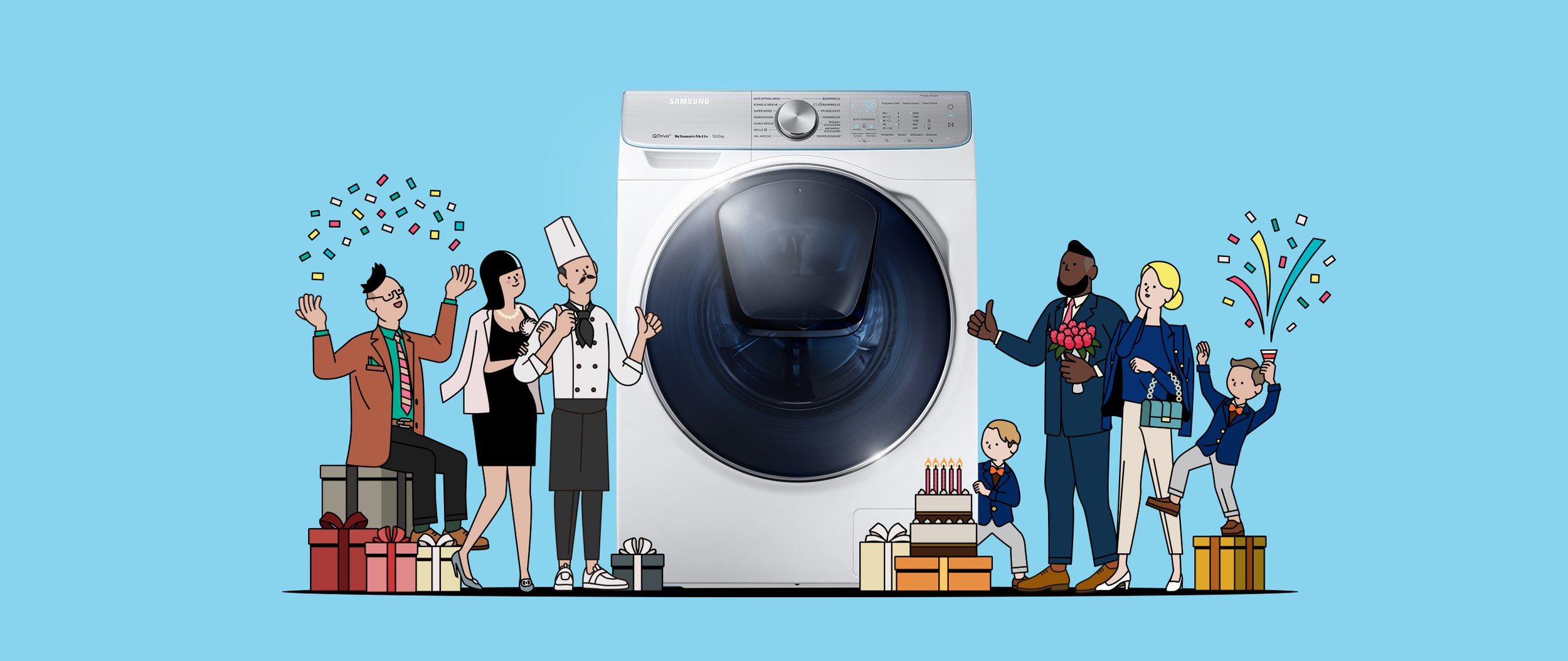
THE STORY OF FIVE CHARACTERS
Features of the product are introduced through the stories of familiar yet charming characters, such as a sports-loving financial consultant and a mother of mischievous twins.
‘운동을 좋아하는 금융 컨설턴트’, ‘사고뭉치 쌍둥이의 엄마’와 같이 친숙하지만 매력적인 캐릭터들이 더욱 흡입력 있는 스토리를 만듭니다.
-
![]()
Cut your laundry time and maximize your day
Successful financial consultant by trade, workout fanatic by choice. Between investor meetings and biking to work, he's always on the move. That means lots of laundry and no time to spare. Thanks to QuickDrive™, he can wash his clothes quickly and thoroughly, without interrupting his busy schedule. In fact, with all that time saved, he'll even be able to go to his friend's birthday party.
-
![]()
QuickDrive™
QuickDrive™ reduces washing time by up to 50% and energy use by 20%, without compromising cleaning performance. Its Q-Drum™ has a ‘main drum’ & a ‘backplate’ that rotate independently, ensuring clothes move in dynamic action powered by double forces.
-
![]()
Finish your wash with no items left behind
Twins mean double the fun and double the laundry, especially with two boys who love to play baseball. Mom can start the cycle and throw any additional items straight into the wash through the AddWash™ door without stopping the washer! Now, she can finish the day's laundry and get to her friend's birthday party with time to spare.
-
![]()
AddWash™
The AddWash™ door lets you simply and quickly add forgotten clothes after your wash cycle has already started. You can also easily pop in hand-washed clothes that you just want to rinse or spin dry.
-
![]()
Keep your schedule on track with Q-rator
The Birthday girl and hostess with the most. But throwing a party is no small feat and time management is everything. Enter the Q-rator's Laundry Recipe function! It recommends the best cycle, lets her select the options, and start the wash from her smartphone, all while getting her hair done at the salon. Now, her tablecloth and fancy napkins will be clean and ready by the time she gets home.
-
![]()
Laundry Planner
Set the end time for your laundry with the Laundry Planner feature of Q-rator. The intuitive interface is easy to use and will even recommend the proper cycle for the given time. The Q-rator smart management system** uses data captured during user interactions to utilize QuickDrive™ more effectively.
-
![]()
Calculate your wash down to the details
Exact measurements and calculations should apply to all facets of life and laundry is no exception. But computing water levels and numbers to ensure a perfect wash made laundry a time-consuming task. Not any more. The Auto Optimal Wash feature calculates the ideal amount of water, detergent and rinsing time for the best clean.Eureka! Can it calculate his sister's birthday present too?
-
![]()
Auto Optimal Wash
Auto Optimal Wash uses 4 sensors to optimize washing results without extra effort. By sensing the weight of the laundry and the level of soiling, it optimizes the amount of water, detergent and rinsing time. The modular 'Auto dispense' is easier to refill, even using high-viscosity detergents.
-
![]()
Wash precious items thoroughly with care
Rising to head chef at a luxury hotel requires skill and fortune. His lucky uniform has been with him every step of the way. He'll need it clean and ready before preparing a birthday feast for his special lady. ecobubble™ effectively removes stains, even in the cold wash, yet is gentle enough for precious garments, so he can use it to wash his lucky charm everyday!
-
![]()
eco bubble™
ecobubble™ technology delivers powerful cleaning, even at low temperatures. Detergent is turned into bubbles, so it quickly penetrates fabric and removes dirt easily, while protecting its color and texture and saving energy.


WEB PAGE DESIGN
The combination of illustrations and products, and the use of bold colors provide a completely differentiated user experience from existing product pages.
일러스트와 제품의 조합, 그리고 과감한 색상의 사용은 기존 제품페이지와는 완전히 차별화된 사용자 경험을 제공합니다.


DYNAMIC INTERACTION : Motion graphic, Parallax Scrolling
Utilized interactive elements such as motion graphics and parallax scrolling to increase content concentration.
모션그래픽, 패럴렉스 스크롤링과 같은 생동감 넘치는 인터랙션을 통해 컨텐츠 집중도를 높였습니다.